Feature #1850
closed
New logo
Description
With the new name we need a new logo.
@ @Jan Belik, can we kindly ask you to provide a new one with OpenAtlas Discovery instead the former OpenAtlasDiscovery, see: https://frontend-demo.openatlas.eu/OpenAtlasDiscovery_logo.png
Once finished please upload the different file variants at the Files menu on top (similar like here for the OpenAtlas logo: https://redmine.openatlas.eu/projects/uni/files)
Thanks a lot!
Files
 Updated by Jan Belik over 3 years ago
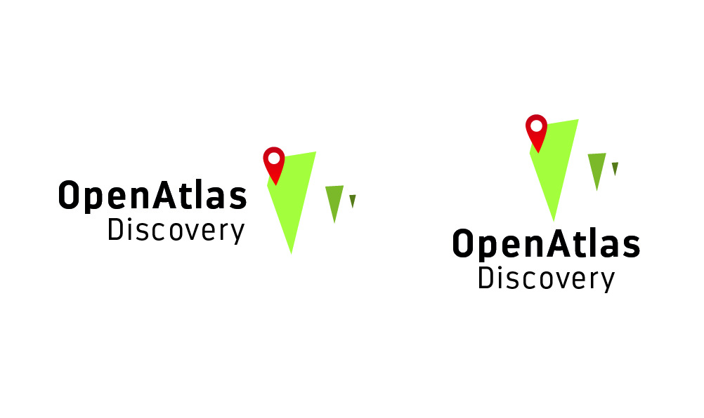
Kindly review this version. I will provide all file formats if approved!
 Updated by Alexander Watzinger over 3 years ago
- Status changed from Assigned to In Progress
- Do we have to decide for one version or is it meant to be used depending on the situation. If I have to choose one I would pick the first, wider one.
- The green colors seem much brighter than in the OpenAtlas logo, is this meant to be? If yes, it's fine with me too.
Of course these are just the thoughts of an old backend developer, I'm curious about the feedback of the more graphical talented young ones :)
Updated by Jan Belik over 3 years ago
Sorry, I did not make it clear: the two logos in the file are the "landscape" and "portrait" versions of the logo. Both can be used, depending on the situation.
The colors are different because of my laziness.... I exported the CMYK file directly to RGB and the algorithm does not produce reliable results.
 Updated by Andreas Olschnögger over 3 years ago
I think they look great! Thanks Jan
 Updated by Moritz Großfurtner over 3 years ago
Thanks Jan, looks good, I really like the Typefacing you did!
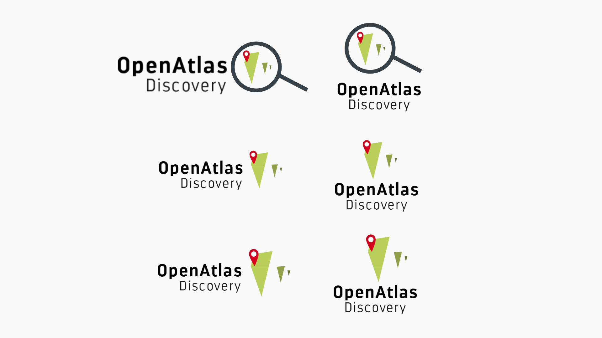
I had the Idea that if we want to distinguish it more from the Open Atlas Logo maybe we could add a looking glass, I tried to mock up what it could look like in the attached file. What's your opinion on something like that?
Other than that I was thinking: Could we make Icon could be a bit smaller in relation to the Text? That feels a bit more proportional to me.
In the file the bottom one is the Normal design, in the middle the one my try at making the icon a bit smaller and at the top the Mock up for adding a looking glass.
I'm looking forward to hearing your input!
Updated by Jan Belik over 3 years ago
- File Open_Atlas_Discovery_Logobaustelle_2.jpg added
Thanks a lot for the Input (and mock up)! It gave me an interesting starting point for thinking further about the new logo.
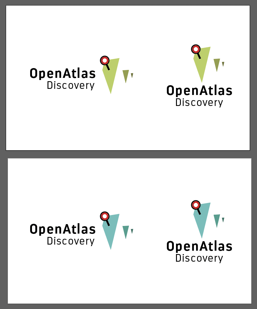
From the branding point of view, changing the general layout of the logo for a "sub-brand" is diluting recognition too much. We have to balance sameness and distinctiveness somehow. Just adding a big looking glass to the graphic element makes it look too crowded. But changing the pin icon to a looking glass works fine, i think! Also, I changed the color of the map elements to add another distinction from the original logo, that makes telling them apart at first glance easier.
How does the new version work for you? Looking forward to hear your thoughts!
Updated by Alexander Watzinger over 3 years ago
Thank you Jan for the new suggestion. For me a change of colors takes much more away of the sameness than the looking glass suggestion from Mocca.
But it may be that you forgot about the CMYK issue again.
Updated by Jan Belik over 3 years ago
- File Open_Atlas_Discovery_Logobaustelle_2A.jpg added
To me i still registers as "Same logo, but in blue". :-) Guess, we'll have to disagree on the color but it still works in the original green - see attached file.
Updated by Jan Belik over 3 years ago
- File deleted (
Open_Atlas_Discovery_Logobaustelle_2.jpg)
Updated by Jan Belik over 3 years ago
- File deleted (
Open_Atlas_Discovery_Logobaustelle_2A.jpg)
Updated by Jan Belik over 3 years ago
Alex just made me aware that the jpgs I uploaded looked very "neon" in his browser. Since my browser rendered the colors differently I was oblivious to the crass color difference!
Please use the screenshot I made of both, green and blue, versions for reference and sorry for the inconvenience.
Updated by Andreas Olschnögger over 3 years ago
- File logo_suggestion.png logo_suggestion.png added
Thanks a lot for theses new suggestions.
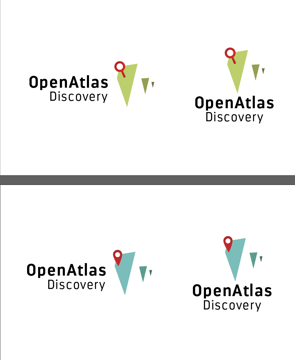
I like them very much and i ha![]()
ve to agree with Jan. I don't think a change of the color would take that much away.
But I would either just change the color or the icon, not both.
Also i think it would be better to keep the magnifying glass in just one color.
I attached some examples.
Updated by Jan Belik over 3 years ago
I attached a screenshot of the new versions of the logo: changed icon and changed color scheme. Both are working fine but - and that is just a personal opinion - I tend to like the green version with the looking glass more.
Updated by Moritz Großfurtner over 3 years ago
Thanks a ton for all the work, input and changes!
I talked about it with Alexa & Andi and we all agree (with you) that the green Version with the looking glass looks best.
Could you upload the finished files?
Updated by Jan Belik over 3 years ago
- File Screen RGB.zip Screen RGB.zip added
- File Print CMYK.zip Print CMYK.zip added
Please tell me if you need anything else. file formats, sizes, etc..
Updated by Alexander Watzinger over 3 years ago
- Assignee changed from Jan Belik to Andreas Olschnögger
Thanks a lot Jan. I uploaded the zip files to the "Files" section (and removed strange mac_os folders while doing so).
Assigning to Andi, you can close this issue as soon as the logo is integrated and has worked out ok.
Updated by Andreas Olschnögger over 3 years ago
- Status changed from In Progress to Closed
Thank you Jan. The new logo looks very nice.