Actions
Feature #1906
closedUnify placement of form error messages
Start date:
2022-11-11
Estimated time:
Description
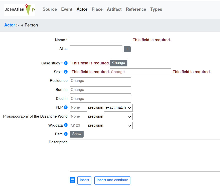
Sometimes validation errors are shown twice and/or at "wrong" location. See screenshot which I managed to make with setting types required. I guess it has to do with errors for hidden fields that are shown too because they have the required CSS class.
Ideally the validation errors would show up only once and on the right side of the input field so that the fields don't change their locations.

Files
 Updated by Alexander Watzinger over 3 years ago
- Start date changed from 2022-12-02 to 2022-11-11
- Follows Feature #1866: Complete Bootstrap layout added
 Updated by Alexander Watzinger over 3 years ago
- Target version changed from 7.9.0 to 7.10.0
 Updated by Alexander Watzinger about 3 years ago
- Subject changed from Form improvements to Unify placement of form error messages
- Description updated (diff)
 Updated by Andreas Olschnögger about 3 years ago
- Status changed from Assigned to Closed
The error messages are now displayed below the input fields.
Changes are in develop
Actions